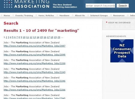
1. The search is crap
To demonstrate, here is the results for my search for “marketing”:

Can you detect a complex search algorithm at work here? Me neither.
They can take some comfort in the fact that very few websites have a decent search engine, but the rule is “if it doesn’t work like Google it doesn’t work at all”.
So what should they do? Simple, just plug in Google search
2. Their “do not call/mail list” is lame
Their claim to fame is the “do not call/mail” list where citizens such as yourself can opt out of receiving phone calls or mail from advertisers.
The catch is that only advertisers that are members of the Marketing Association of New Zealand get this list.
So the most annoying spammers and market surveyors probably aren’t members. So you will probably continue to get junk mail and phone calls during dinner, even after to spend 30 minutes of your life working through this tedious process.
And by the way, the “do not call” and “do not mail” lists are completely separate forms and you have to enter each person in your household separately too. Enjoy.
3. They serve banner ads
For example:
Why?
To earn revenue?
They should just stick to what they’re doing and choose not to distract their visitors from their task.
It makes them look cheap. Who do they think they are? The NZ Herald?
And I suspect that these 3 customers are not paying the ratecard rate because at $400/month for the homepage and $320/month for the rest of the website, do you think they’ll ever get a return on investment?
4. They don’t have blogs or a forum, there is no 2 way communication
Marketing is built on communication is it not?
Where are the blogs? Where are the Question and Answer forums? Where are the links to other social networking such as Twitter or Linked-in?
They are absent.
They should be leading the way with marketing techniques in the 21st century, but sadly, it seems they are stuck in the 90’s.
5. They use “click here” for internal hyperlinks
This is poor for users because it doesn’t provide “information scent” – a preview of what they will see on the next page (because often when people read on the web, they scan quickly and read only hyperlinks).
And they are missing a Search Engine Optimisation opportunity here too because Google loves keyword rich anchor text in internal hyperlinks.
6. No breadcrumbs and no highlighting of the page you are on, so you get completely lost
These are 2 standard features that are completely missing from this website, and that is why you will get lost in minutes if you bother having a look around.
7. They list a fax number on their contact page
What the hell is a fax machine anyway? I’ve never heard of it.
8. Their email addresses are plain text
I shudder to think how many spam emails their staff get.
Why do I care? Because I have less confidence that an important email I send them will get blocked or deleted by an overly aggressive spam filtering system.
What should they do? Use HiveEnkoder to obfusicate their email addresses so spambots can’t read them, but humans can (and can still click on them). It creates a little bit of javascript code that can be easily inserted in to the html.
9. The national news page doesn’t even have dates and the headlines are as boring as hell
See for yourself:
What should they do? Incorporate thumbnails to give it some life, have the full date, and show a few sentences as a teaser.
10. In the footer, the copyright is 2005
This tells me it has been 4 years since their last major upgrade. And it shows. The site is dated.
Are the web developers – Net Concepts to blame?
No. I’m not hassling the original web developers: Net Concepts. Infact, their latest stuff is really really good. But if I was them, I’d either put pressure on the Marketing Association of New Zealand to let them build them a new website, or ask them to remove the hyperlink, because it’s just embarrassing being associated with them.
What next then?
If you represent the Marketing Association you may be a bit pissed off with this report, but somebody had to wake you up. I’m for hire, I can help you fix these things, so call me on (07) 575 8799.
And if you have a website of your own and you want a frank, honest, cut-the-crap evaluation of your website, so you can start generating business from it, you can call me too: (07) 575 8799 (only call if you promise not to cry over the phone when I point out all your mistakes).


