Radio Advertising Is Mostly A Waste Of Money, But Here’s 4 Tips To Give You A Chance At Making A Radio Ad That Works

Radio DJ Mixing Vinyl

Very soon I will share with you 4 tips on how to write a radio ad that actually works. But first, I want you to think about radio advertising from your point of view as a member of the audience.

Q: Why do you listen to the radio?

  • Music?
  • Witty Commentary?
  • Advertising?
  • Because you like hearing the same weather report and news headlines every 15 minutes?

Q: Where are you when you listen to the radio?

  • In the car?
  • On your morning run or bike ride?
  • In the office?
  • On the toilet?

Q: What do you do when the ads come on?

  • Change the radio station?
  • “Zone out” while you wait for the music or chat to start again?
  • Listen carefully for the latest sales and bargains?

You can see that there are a million potential distractions that can prevent your advertising message getting through to your radio audience.

And radio is a mass-media form of advertising after-all, so there is a huge amount of wastage (I hate wastage!).

Your potential audience could be 10,000 people, but how many of those people are:

  1. Listening attentively…
  2. at that precise moment in time…
  3. that need what you are selling…
  4. and are motivated enough to take action?

Probably none.

If you ask a radio advertising sales person what it takes to generate business for you using radio advertising, they will tell you there are 2 things you need:

  1. High repetition/frequency
  2. Say your brand name heaps

That is complete bullocks!

They say “repetition” because they want you to buy more ads.

They say “brand name” because that’s what your boss is more likely to approve the ad because he loves to hear his brand name again and again.

As you can probably tell by now, I am not a fan of radio advertising and haven’t recommended it to any of my clients for years.  I’ve tried it several times, but it didn’t generate any results.

And if you’re not getting results from your advertising (or you don’t know how to measure them), then what’s the point? You might as well flush your advertising dollars down the toilet!

But this morning, whilst running, I heard a radio ad that had all the elements of success going for it.

If any radio ad can be successful I think this is it

I make that assessment on the basis that I heard it once and I remembered several key facts about it.

Try it yourself. Listen to the following mp3 once, and then I’ll test you on what you remember:

Possibly the most effective radio ad ever created (514Kb .mp3)

Have you listened to the ad yet? You have? Great!  Now, can you answer these questions after listening to the ad just once?

  1. What is his name?
  2. What is he offering?
  3. How does he distinguish himself from the competition?
  4. What should you do next if you want to contact him or find out more?

I wouldn’t be surprised if you can answer all these questions.

Do you realise how amazing that is?  After a single exposure?

So what can we learn from this?

What do you have to do to write a radio ad like this that at least has a chance at generating results for you?

Here is your lesson for the day:

4 Essential Components of a Radio Ad

1. Target your audience with your opening sentence

The opening sentence is exactly like a headline in a newspaper. If you don’t like the headline you don’t read the article.  It’s the same with radio ads.  If the opening sentence doesn’t speak to you, you “zone out” and don’t listen to the rest of the ad.  At first, you might think that’s bad, but that’s great!  It means you speaking to your target audience directly, and people who aren’t interested are being filtered out.

2. Use the word “you” through-out your ad

This is just like speed dating.  You only have 30 seconds, so do you talk about yourself or do you talk about them?

You talk about them of course!

Don’t make the mistake of talking about you and your business “we do this, and we do that”. Borrrr-ring!

What do people care about more: themselves or what you are trying to sell them?

Themselves!

So talk about the listener, what they want, what they need, and use “you” and “your” constantly.

3. Distinguish yourself with a single fact

You’ve only got time to state 1 fact.

The amazing thing about this is that is the fact doesn’t have to be overly impressive, it just has to be distinctive.

In this example, Aaron said he was “one of NZ’s youngest celebrants”.  Amazing? No. Distinctive? Yes!

4. Make the call to action a website address

The #1 most common mistake in radio ads is stating a phone number as the call-to-action.

Phone numbers are too hard to remember! (Even word numbers eg 0800 CALL ME NOW). They might rattle around in your brain for a few seconds, but you know that by the time you find a piece of paper and a pen (or your cellphone), they will be gone. So you don’t bother.

A website address works because is probably uses the same brand name that was mentioned in the ad with a “.co.nz” on the end of it. Easy to remember. Easy for your audience to type in when they next get to a computer (or remember days or weeks later!)

Need More Help?  Need to Generate Better Results From Your Advertising?

If you have a small-medium sized business in Tauranga, then I can help you with your marketing and advertising.

I hate wastage, so I’ll choose mediums that work, I’ll measure the results, and I’ll make you truck loads of cash.

Call me now on (07) 575 8799 or email me for your FREE 45 minute Marketing and Advertising Review.

8 Tips For Getting Better-Than-Average Results From Your First Tradeshow or Expo in New Zealand

1. All the best booths gone? Only a few right at the back to choose from? Fine!

Don’t worry too much about your location.

You instinctively think that a high traffic area would be better, but don’t make that assumption (most people assume that a #1 position using google Adwords is the best, but you end up attracting “click-happy” people who reduce your conversion rates and burn through your cash)

Most visitors will walk around the entire tradeshow/expo. You’ll get a chance at making a connection wherever you are. So don’t stress about it. (And if you wait until the last minute you can get some really good discounts from the organisers!)

2. Say hi to everyone who walks past. Everyone. (And everytime they walk past)

There’s a fine line between looking desperate, and being friendly and approachable.

But the simple act of saying hi has a profound psychological effect.

It taps in to a basic human need – the need for connection.   In response, most will turn and give your posters and branding a chance to speak to them.

3. Bring your hottest employees

Everyone likes a bit of eye candy at tradeshows and expos. If they know your product inside out, all the better.

4. Minimise your branding, maximise the benefits you are offering

This may be hard to hear, but no-one really cares about your brand.  They only care about themselves and if you can help them.

So don’t make the classic mistake of branding the background of your booth with huge logos. The trick is to write benefit driven headlines and bullet points.

The purpose is to give walkers-by a snapshot of what you do so they can decide if they need your services.  This way, you get  the visitors who want the benefits you state in your headline and bullet points, to stop and talk to you, and everyone else walks away. Good! That’s what you want!

5. Write notes on business cards as you collect them

Write a few notes on the back of prospects business cards to remind you who they are later.

You could record your impressions about how likely they are to become clients.

And for bonus points, write a note about what they told you about their business to jog your memory later, so you can personalise your follow up email to them.

6. Don’t just require a business card for the prize draw, have an entry form

This is a common mistake.

You think that just asking people to pop a business card into the fish bowl or entry box is easy right?

Yes, it’s easy for them, but it’s hard for you.

It’s hard for you to determine if those prospects are real candidates for new business.

It’s hard for you to avoid wasting time on those that aren’t.

So on your entry form (A6 size, in pads bound with plastic coils work really well) have space to staple their business card to the form (and provide a stapler), and ask them filtering questions about their needs.

For example “what brand of accounting software are you currently using?” (if you sell accounting software), “how many employees to you have” (if you are selling HR services), “what’s the #1 annoying thing about xyz?”

There is nothing worse than drawing the winner to find someone completely unsuited to being a client of yours.  What a waste!

In fact, I suggest you go through the entries and throw the unsuitable entries in the bin before you do the draw.

7. What should the prize for the prize draw be?

You could go with a voucher for discounts on your services, or you could go with something with a much wider appeal like an iphone.

I say cast the net wide by offering the later, and let your entry form do the filtering for you.

8. Follow up super-fast

Have a follow-up plan in place before you go.

For example if it’s a 3 day trade show or expo, that night from your hotel, email the new contacts you made, just to say hi (you can sell to them later, this time you just want to stand out from the hundreds of people they met that day).  Or you might email the contact details to a staff member for sending out the next morning (using your email address).

One time I got a text message from an ANZ business banking rep just to say he enjoyed meeting me – within 5 minutes of leaving his booth! That made a huge impression.

What tips do you have to add?

Have you been to tradeshows and expo’s here in New Zealand? As an exhibitor? As a visitor? What have you seen or done that worked?  Write your thoughts in the comments below.

How To Feature Your Business In Any Major NZ Magazine For $2.57

In 3 Easy Steps

Step #1:

Contact the publisher/distributor and get a special deal for about 50/100 copies of the next issue.  Tell them this is their chance to expand their subscriber base and you want them for free.

Step #2:

Announce to prospective clients (like at a trade show, conference, expo, chamber of commerce, business after 5 meeting, or pub crawl), that you’re being featured in the next issue of xyz magazine and ask if they’d like a free copy sent to them.

Step #3:

When your magazine copies arrive, place your business card and a branded post-it note somewhere in the first few pages.  Handwrite a personalised message on the post-it note eg “Dear Bob, good to meet you the other day! Cheers, Dave” (if your name is not Dave, replace that name with your own).

That’s how you feature your business in any major NZ magazine!

Cost Breakdown For Each Magazine “Feature”:

  • Magazine: Free
  • Business Card: $0.40
  • Post-it Note: $0.07
  • A4 Envelope: $0.60
  • Postage: $1.50
  • Total: $2.57

(Disclosure: I stole the basics of this idea from here)

Want More Cunning Ideas For Marketing and Advertising Your Business?

Then give me a call on (07) 575 8799 or email me, I’d like to help (first 45 minutes is free).

Viral Video – How Do You Create a Viral Video For Your Business?

Have you wondered how to create a YouTube video that “goes viral” and creates a torrent of new clients for your business?

Here are 3 essential components for a viral video that can generate business for you:

  1. It must be entertaining/hilarious/amazing
  2. It must have a business objective, a reason for being
  3. A mechanism so that people can connect with you and become a customer

Here are 2 videos that have fulfilled those 3 requirements:

1. “Mattress Dominoes World Record Attempt” (Bensons for Beds, UK)

What we can learn from this video

  1. You don’t have to push your agenda/brand (interested people will seek you out), put the focus on the entertainment value – in this case a World Record Attempt
  2. Leave clues to who you are
    • Sign up for a new YouTube account using your brand name
    • Be very subtle with your branding – in this case, the door of the truck had everything prospective clients needed

2. “Printing’s Alive” (Pazazz Printing, USA)

What we can learn from this video

  1. Be passionate about who you are and what you do. It’s infectious. People are envious of passionate people, because their own lives are mostly dull
  2. Tell a story

What other examples of corporate viral videos have you seen? Provide links to them in the comments below.

May I help you work on some viral video ideas for your business?

Talk to me, by email, or phone (07) 575 8799.

Cheers,

Sheldon Nesdale.

10 Reasons Why the Marketing Association of New Zealand’s Website Sucks

1. The search is crap

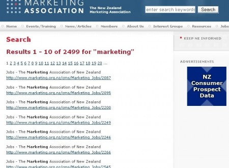
To demonstrate, here is the results for my search for “marketing”:

Search for “Marketing” on Marketing Association of NZ website

Can you detect a complex search algorithm at work here? Me neither.

They can take some comfort in the fact that very few websites have a decent search engine, but the rule is “if it doesn’t work like Google it doesn’t work at all”.

So what should they do? Simple, just plug in Google search

2. Their “do not call/mail list” is lame

Their claim to fame is the “do not call/mail” list where citizens such as yourself can opt out of receiving phone calls or mail from advertisers.

The catch is that only advertisers that are members of the Marketing Association of New Zealand get this list.

So the most annoying spammers and market surveyors probably aren’t members. So you will probably continue to get junk mail and phone calls during dinner, even after to spend 30 minutes of your life working through this tedious process.

And by the way, the “do not call” and “do not mail” lists are completely separate forms and you have to enter each person in your household separately too. Enjoy.

3. They serve banner ads

For example:

3 Examples of Ads on the Marketing Association of NZ Website

Why?

To earn revenue?

They should just stick to what they’re doing and choose not to distract their visitors from their task.

It makes them look cheap. Who do they think they are? The NZ Herald?

And I suspect that these 3 customers are not paying the ratecard rate because at $400/month for the homepage and $320/month for the rest of the website, do you think they’ll ever get a return on investment?

Advertising Rate Card for MANZ website

4. They don’t have blogs or a forum, there is no 2 way communication

Marketing is built on communication is it not?

Where are the blogs? Where are the Question and Answer forums? Where are the links to other social networking such as Twitter or Linked-in?

They are absent.

They should be leading the way with marketing techniques in the 21st century, but sadly, it seems they are stuck in the 90’s.

5. They use “click here” for internal hyperlinks

2 Examples of Using "click here"

This is poor for users because it doesn’t provide “information scent” – a preview of what they will see on the next page (because often when people read on the web, they scan quickly and read only hyperlinks).

And they are missing a Search Engine Optimisation opportunity here too because Google loves keyword rich anchor text in internal hyperlinks.

6. No breadcrumbs and no highlighting of the page you are on, so you get completely lost

These are 2 standard features that are completely missing from this website, and that is why you will get lost in minutes if you bother having a look around.

7. They list a fax number on their contact page

fax

What the hell is a fax machine anyway? I’ve never heard of it.

email-addresses

8. Their email addresses are plain text

I shudder to think how many spam emails their staff get.

Why do I care? Because I have less confidence that an important email I send them will get blocked or deleted by an overly aggressive spam filtering system.

What should they do? Use HiveEnkoder to obfusicate their email addresses so spambots can’t read them, but humans can (and can still click on them).  It creates a little bit of javascript code that can be easily inserted in to the html.

9. The national news page doesn’t even have dates and the headlines are as boring as hell

See for yourself:

Screenshot of so-called "National News" page

What should they do? Incorporate thumbnails to give it some life, have the full date, and show a few sentences as a teaser.

10. In the footer, the copyright is 2005

copyright

This tells me it has been 4 years since their last major upgrade. And it shows. The site is dated.

Are the web developers – Net Concepts to blame?

No. I’m not hassling the original web developers: Net Concepts.  Infact, their latest stuff is really really good. But if I was them, I’d either put pressure on the Marketing Association of New Zealand to let them build them a new website, or ask them to remove the hyperlink, because it’s just embarrassing being associated with them.

What next then?

If you represent the Marketing Association you may be a bit pissed off with this report, but somebody had to wake you up.  I’m for hire, I can help you fix these things, so call me on (07) 575 8799.

And if you have a website of your own and you want a frank, honest, cut-the-crap evaluation of your website, so you can start generating business from it, you can call me too: (07) 575 8799 (only call if you promise not to cry over the phone when I point out all your mistakes).

How We Created a Highly Targeted and Inexpensive Direct Mail Campaign and Achieved a Response Rate of 5.3%

The Story

The client was about to build a new pier that would contain space for 2 restaurants/bars/cafes.

We decided early on that the best bet would be to advertise locally because we knew that many of the owners of these restaurants/bars/cafe’s own several establishments and may have intentions to add to their portfolio or be open to re-locating to somewhere higher profile.

Objective: To motivate restaurant owners in the Tauranga area to consider moving premises to the yet-to-be-built Pier development

The 5 Step Approach (that I always use)

  1. Generate a list of ideas how to communicate with this audience
  2. Select the method that offered the best opportunity for Return on Investment
  3. Develop the creative as required
  4. Deliver the creative to the audience
  5. Measure the results

Download creative samples for this Direct Mail campaign (201 Kb .pdf)The 3 Reasons Why We Chose Direct Mail in This Case:

  1. Easy access to a list of addresses (I simply copy and pasted address details for 120+ restaurants/bars/cafes from the YellowPages.co.nz directory)
  2. Ability to customise the letter for each recipient so it appears the letter was personally written just for them (its easy to ignore a letter that says “Dear Sir/Madaam”, but it’s hard to ignore one that bears your name, and in this example, the name of your restuarant)
  3. Easy connection between MS Word and MS Excel by using “Mail Merge” to pump out the finished documents

Results

It is common for Direct Mail campaigs to generate about 1% response rate. This campaign achieved 5.3% response rate.

Could your business benefit from results like these? It’s time to hire your own marketing department (but at a fraction of the cost)

Is Honesty Really The Best Policy? Honest Marketing Even When The Truth Hurts – A Case Study

I just helped put together a “customer satisfaction survey” for a client.

(P.S. I used Open Source survey software – Lime Survey.  I use open source, free software whenever I can to save money for my clients.  But I don’t put up with crap. If it’s free and good quality, then I’ll use it. If it’s free and crap quality, I won’t. It’s that simple)

Here are the 4 challenges I faced, and how I overcame them:

  • Challenge #1: Generate A High Response Rate
  • Challenge #2: Rewrite The Questions In A Way That Motivated The Respondents To Answer Them
  • Challenge #3: Generate High Quality Responses That We Can Do Something With
  • Challenge #4: Decide How To Publish The Results That Serves Our Goals For Both Current Students And Prospective Students

Challenge #1: Generate A High Response Rate

Don’t you hate it when you put blood sweat and tears into a customer survey (or any other marketing campaign at all for that matter), only to get a few responses back?

I sure do. What a waste of time.

For this customer satisfaction survey, we sent out 280 invitations and got 179 responses. That’s a response rate of  63.8%.

Do you think that’s good? I sure do.

Part of the reason for such great results might be because this group of people is particularly willing to help improve the programme.

But here are 3 more ways I helped boost that response rate:

Radio Buttons Example

The survey was easy, fast and short:

  • Easy: Only a couple of closely related questions on each page. Every question was optional so there were no annoying pop-up boxes of errors when they tried to go to the next page.
  • Fast: I used radio buttons wherever I could, so the respondents could have their say with just a click.   And for the free-text fields, the size of the text-box indicated how short or long we wanted their answers to be
  • Short: A progress bar at the top let them know how much long the survey was. I kept the questions to a minimum. We didn’t really need their contact details “just in case” so we didn’t burden them by asking for that information.

    progress-bar

Plus, I used my word-smithing skills to ensure the respondents that their responses weren’t going to end up in a report that gets glanced at once and then ends up on a shelf somewhere to gather dust (subtle techniques that I won’t describe here).

Challenge #2: Rewrite The Questions In A Way That Motivated The Respondents To Answer Them

Seems obvious doesn’t it?

But have you ever been suckered into participating in a survey that doesn’t seem to care about your motivation?

Have you quit half way through in disgust (because of the time you’d wasted up to that point), or blundered through (paying little attention to the quality of your answers) simply because you didn’t want the entire session to be a complete waste?

I bet you have.

Here’s an example of how I rewrote a question to motivate the respondents to answer it:

Old Question: “Rate the following out of five: ‘The programme has helped me develop my knowledge, skills and attitudes’  1 2 3 4 5”

New Question: “Apart from learning about Management, how else has the programme helped you? (Eg confidence, knowledge). What have you done since joining the programme that you would not have considered before? (Eg applying for that Management role). Tell us your story.”

You might be thinking “that question is huge, no one will bother to read it, let alone answer it!”.

Well, if you thought that, you’re dead wrong.

143 responded to that question (a whopping 79.9% of the respondents).  The average response was 42 words (6000 words in total).

And we got a huge amount of very quotable responses and an invaluable insight into why people choose the programme.

Challenge #3: Generate High Quality Responses That We Can Do Something With

Why spend so much time and effort conducting a customer satisfaction survey and then let the responses get dusty on a shelf somewhere?

This was our opportunity to ask our customers what changes we should make to the way we operate. But first, we had to ask questions in such a way that management would know exactly what needed to be done when those results came in.

We met that challenge by providing an appropriate combination of quick response questions and long answer questions and stimulated thinking and a high level of response.

Interestingly, in previous paper based versions of this survey, the responses to the long answer questions were short.  In this online version, responses were much bigger and of much higher quality.  Many were 300 words+ for a single answer (that would be over a page if it was hand-written).

It was a lot for us to read, but full of very useful information.

Challenge #4: Decide How To Publish The Results That Serves Our Goals For Both Current Students And Prospective Students

How did we serve both our current students and prospective students?

We published many of the results online so that when current students come accross them, they can see that we listen carefully to what they have to say.  And for prospective students, they see unedited testimonials regarding the quality of the programme.

Is Honesty Really The Best Policy?

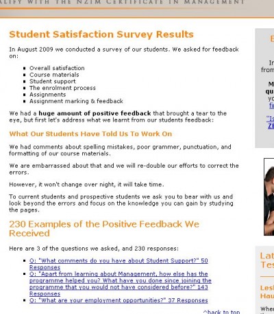
The first few paragraphs of the webpage for the survey results is shown in the screenshot below:

survey-results

As you can see, we started with the bad news “what our students have told us to work on” which talked about spelling mistakes, poor grammer, punctuation and formatting in the course materials.

Why did we do this? 3 Reasons:

  1. This level of honesty is rare. It get’s peoples attention. Normally, when survey results as released to the public, they are edited and the unpleasant bits are either removed or watered down.
  2. It provides contrast to the rest of the page which is a list of 230 positive comments that students made about the programme
  3. It has positive effects on both target groups. Current students know that we listen to them.  Prospective students see that we listen to current students and they trust us because we don’t hide the truth, and therefore they are more likely to join us as students

May I help you put together a satisfaction survey or market research project like this?

Talk to me, by email, or phone (07) 575 8799.

Cheers,

Sheldon Nesdale.